The Challenge
Finance leaders across a global firm needed to make fast, data-driven decisions — but their reporting tools were fragmented, technical, and difficult to navigate without analyst support. There was no single guided entry point for financial data; leaders spent hours hunting for relevant numbers across disconnected systems.
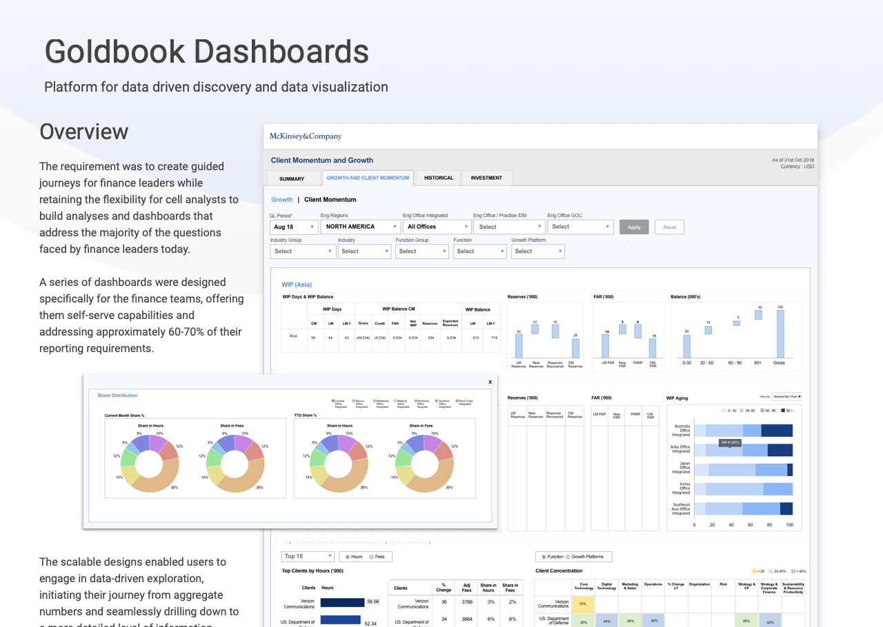
The requirement was to create guided journeys for finance leaders while retaining the flexibility for cell analysts to build analyses and dashboards that addressed the majority of questions faced by finance teams today — all in a scalable, self-serve way.
Design Lead Across Discovery to Delivery
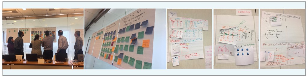
I led the design across the full project lifecycle — from facilitating in-person co-design workshops with business champions and stakeholders across geographies, through to crafting the final high-fidelity prototypes for each workstream. A key challenge was getting data visualisations right while coordinating with the OBIEE technical team for implementation.
A Five-Phase Design Process
The design process was deeply collaborative and iterative — grounded in research, brought to life through workshops, and continuously validated with the users who would rely on the dashboards daily.
Desk Research
Conducted foundational research to understand the business problem, primary users, and the existing user journeys, opportunities, and pain points.
User Interviews
Identified users from different work streams and geographies to conduct in-depth interviews, asking them to walk through the KPIs they use for daily reporting.
Co-Design Workshop
Ran an in-person workshop with all business champions and stakeholders to define the problem, share understanding, identify the most critical KPIs, and establish collaboration leads for each work stream.
Prototyping
Presented preliminary prototypes as a starting point, sparking new ideas through discussions and exercises. Designed high-fidelity dashboards for each workstream, aligning data visualisations with the OBIEE team.
Validation & Iteration
Each dashboard went through rounds of stakeholder review. Iterated based on recommendations before final submission for development.
Designing for Instant Clarity
Finance leaders need to make rapid decisions. The core design principle was that a user should be able to grasp the overall financial health of their sector in the first 5–10 seconds of opening a dashboard — without needing to hunt for data.
Guided Journeys
- Clear entry point for each finance leader role
- Aggregate numbers as the starting view
- Drill-down to granular detail on demand
- Progressive disclosure — overview before detail
- Consistent navigation patterns across dashboards
Self-Serve Capability
- Analysts able to build custom analyses independently
- Scalable design patterns reused across workstreams
- 60–70% of reporting needs met without analyst support
- Data-driven exploration from aggregate to detail
- Workstream-specific dashboards with shared language
From Data Overload to Instant Insight
The Goldbook dashboards fundamentally changed how finance leaders engage with data — from a passive, analyst-dependent experience to an active, self-serve one.
5–10 seconds to a comprehensive view of a sector's financial health — the most impactful measure of the design's success.
60–70% of finance reporting requirements now addressed directly through the self-serve dashboards, without needing analyst involvement.
Scalable design system deployed across multiple workstreams and geographies — ensuring a consistent experience regardless of role or region.
Guided exploration model — users move naturally from aggregate summary to drill-down detail, enabling richer financial analysis without training.